Dive Deep is one of Amazon’s Leadership Principles1. It states
Leaders operate at all levels, stay connected to the details, audit frequently, and are skeptical when metrics and anecdote differ. No task is beneath them.
Jeff Bezos wanted every senior leader to stay connected to the details of their business. So Amazon created a scalable and repeatable process where teams can comprehensively answer the following questions with actionable data:
The process is called the Weekly Business Review (WBR). The WBR is a carefully constructed metrics review process, where the right set of input and output metrics, combined with a specialized user experience, allows leaders to analyze hundreds of metrics within a relatively short time. It remains one of Amazon’s secret weapons — an organizational practice that has enabled them to get the little details right over a period of decades.<
The WBR App is a web application that takes your input and output metric data and builds an HTML-based report called a WBR Deck, so that you may implement an Amazon-style WBR process in your organization. The App is designed for you to get up and running quickly; we expect that you will move to a more automated process once you’ve gotten used to the WBR.
Like many Amazon processes, the WBR has a fractal quality to it. The WBR App can be used by a small team, a departmental organization, or for the entire company.
The WBR App won’t help you identify your input and output metrics. But it should save you some time in creating an actionable WBR Deck once you have the right set of metrics.
The WBR App is targeted towards Business Intelligence team members, Program Managers, Product Managers, and Data Analysts who want to use the WBR App to prototype or build their WBR Decks.
In order to use the WBR App, you should be comfortable working with metrics that come from your organization’s source data systems and editing simple text configuration files that tell the WBR App how to build the WBR Deck according to your needs. Once you have built your WBR Deck, you can publish it to a URL and optionally password protect access to the Deck.
The first thing you need to do is install a working version of the WBR App. This free, open-source application, along with instructions on how to install it within your organization, can be found in this GitHub repository.
You upload your data in the form of two files: 1) a comma-separated values (CSV) file and 2) a YAML configuration file that describes how the WBR Deck should be built. The WBR App will use both files to generate a WBR Deck and display it in your browser. You then use this generated webpage to run your WBR meeting.
If you wish to import the WBR data into your own data visualization system such as Tableau or Looker, the WBR App also generates a JSON file which you can use. JSON stands for JavaScript Object Notation. It’s a standardized data format to transport data from one system to another system.
Finally, this document assumes that the WBR App is hosted and reachable via a web URL. This URL may be a public one or it may be restricted within your organization. Contact us at Working Backwards if you’d like more information on how to deploy the WBR App inside your corporate network.
Most data visualization applications cannot generate an Amazon-style WBR Deck out of the box. The WBR App takes daily data as an input, and then transforms it in three ways (weekly, monthly, and period-to-date) which is required for Amazon-style WBR graphs and tables. The WBR App doesn’t change any of your data. It just aggregates and stores the data in this manner so that it is easier to construct your WBR Deck.
Let’s break down the two pieces of information you’ll need to provide to the WBR App.
The WBR App expects you to upload your daily data in a specially formatted CSV (comma-separated values) file. The format looks like this:
Which should look like this when you open the csv file in a text editor:
Date,metric_one,metric_two,metric_three
2022-05-01,123,’456,000’,0.234
2022-05-02,321,’654,100’,0.235
2022-05-03,236,’885,200’,0.352
There is no limit to the number of rows or columns you can have. The first row will define your column names. The first column in the first row should be labeled, “Date”. The rest of the columns in the first row can be any value you want.
Note that numbers with commas in them must be quoted, which is a quirk of the CSV file format. If you do not put quotes around a number with commas, the number will be interpreted to mean that it belongs to two different columns. So ‘456,000’ will be interpreted by the WBR App to mean two separate columns — e.g. ‘456’ and ‘000’ instead.
It is also possible to have multiple rows for each date. For instance:
Notice that for 2022-05-02, both rows are labeled ‘US’. This is valid data — in this particular case, the WBR software will just aggregate the data for that date according to an aggregation function (such as ‘sum’, or ‘mean’) which you will define in your configuration file. We’ll cover how to do that in the next section.
Finally you should note that:
How do you get your data ready? One simple way is to load data from various parts of your organization into an Excel or Google spreadsheet, and then save it as a .csv file at the end of each week. This may seem hacky, but it is a perfectly acceptable starter solution. (Recall: the WBR App is meant for prototyping your WBR Deck. We expect that you will implement a more automated system down the line. Using Excel and the WBR App is intended to get you up and running with regular WBR meetings!)
At any rate, once you have your metric data ready, you may start writing a configuration file to turn these raw columns into aggregations and visualizations. Let’s take a look at that now.
YAML is a human-friendly data serialization language for all programming languages.2 It is commonly used to create configuration files. In order to generate your deck, you will need to create a configuration file to define your metrics and lay out your visualizations.
The WBR YAML configuration contains three main sections. The setup section is the metadata about the deck (e.g. the title of the deck, the time period the deck covers, etc …). The metrics section is where you define the metrics that will be used in the deck. A metric can be as simple as mapping one-to-one to a column in the data you provided, or you can define more complex transformations to generate new derived metrics. Finally, the deck section defines how the data will be displayed in the deck.
Putting it all together, the YAML format looks like this (do not worry if you do not understand it right now — we’ll break it down in a bit):
					setup:
 week_ending: 25-SEP-2021
 week_number: 38
 title: WBR Daily
 fiscal_year_end_month: DEC
 block_starting_number: 1
 tooltip: true

metrics:
 Impressions:
   column: Impressions
   aggf: sum

 Clicks:
   column: Clicks
   aggf: sum

 ClickThruRate:
   metric_comparison_method: bps
   function:
     divide:
       - metric:
           name: Clicks
       - metric:
           name: Impressions

 PageViews:
   column: "PageViews"
   aggf: sum

 PageViews Target:
   column: "PageViews__Target"
   aggf: sum

 MobilePage_Views:
   column: "MobilePageViews"
   aggf: sum

 VarianceToPlanPageViews:
   function:
     difference:
       - metric:
           name: PageViews
       - metric:
           name: PageViews Target

 PercentageVarianceToPlanPageViews:
   function:
     divide:
       - metric:
           name: VarianceToPlanPageViews
       - metric:
           name: PageViews Target


deck:
- block:
   ui_type: 6_12Graph
   title: Ad Impressions (Millions)
   y_scaling: "##.2MM"
   metrics:
     Impressions:
       line_style: primary
       graph_prior_year_flag: true

- block:
   ui_type: 6_12Graph
   title: Total Page Views (Millions)
   y_scaling: "##MM"
   metrics:
     PageViews:
       graph_prior_year_flag: true
       legend_name: Page Views
     PageViews Target:
       line_style: target
       graph_prior_year_flag: false
       legend_name: Page Views - Target
     MobilePage_Views:
       line_style: secondary
       graph_prior_year_flag: true
       legend_name: Mobile Page Views

- block:
   ui_type: section
   title: ""

- block:
   ui_type: 6_WeeksTable
   title: "Page Views Actual vs Plan Summary"
   rows:
     - row:
         header: "Page Views"
         style: "font-weight: bold; background-color: LightGrey; text-align:left;"
     - row:
         header: "Actual"
         metric: PageViews
         style: "text-align:right;"
         y_scaling: "##MM"
     - row:
         header: "Plan"
         metric: PageViews Target
         style: "text-align:right;"
         y_scaling: "##MM"
     - row:
         header: "Variance to Plan"
         metric: VarianceToPlanPageViews
         style: "text-align:right;"
         y_scaling: "##MM"
     - row:
         header: "Variance to Plan (%)"
         metric: PercentageVarianceToPlanPageViews
         style: "font-style: italic; text-align:right;"
         y_scaling: "##.1%"
     - row:
         header: "YOY"
         metric: PageViewsYOY
         style: "font-style: italic; text-align:right;"
         y_scaling: "##.1%"
     - row:
         header: "WOW"
         metric: PageViewsWOW
         style: "font-style: italic; text-align:right;"
         y_scaling: "##.1%"

- block:
   ui_type: 6_12Graph
   title: Page View YOY Growth Rate
   y_scaling: "##.1%"
   metrics:
     PageViewsYOY:
       line_style: primary
       graph_prior_year_flag: false
       legend_name: PV YOY
Let’s go through what these are.
As mentioned above, the YAML file is split into three parts:
The deck setup section is the first set of properties you will see in a WBR App YAML file, denoted with the name setup.
					setup:
  week_ending: 25-SEP-2021
  week_number: 44
  title: WBR Daily
  fiscal_year_end_month: MAY
  block_starting_number: 2
  tooltip: true
  x_axis_monthly_display: trailing_twelve_months
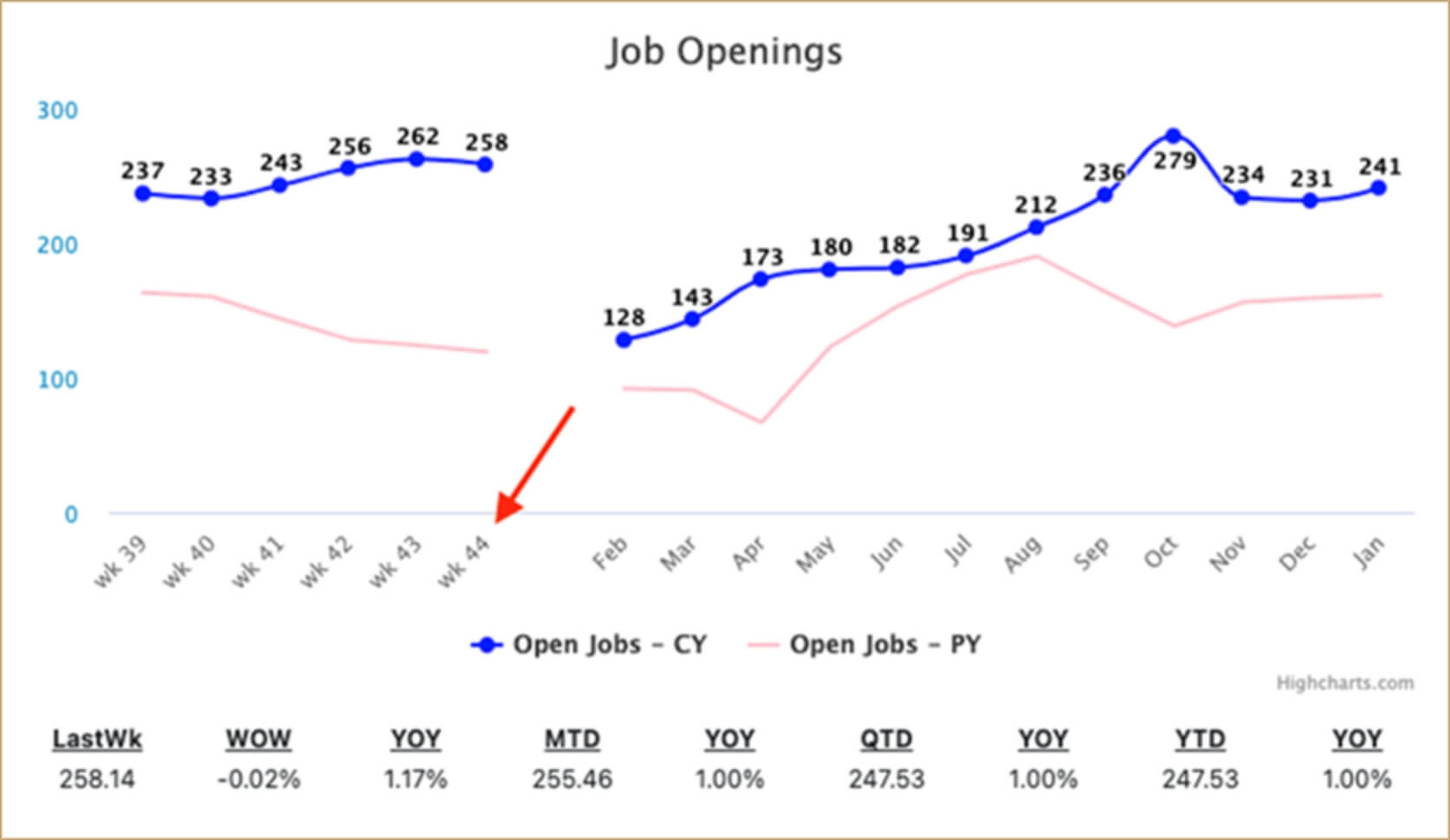
The metrics definitions section are where you’ll define metrics for use in the rendered blocks in your WBR Deck.
Note that you must create metrics — no column in the CSV file will be used in the WBR Deck if you do not first define it as a metric.
There are three different ways to create a metric: basic, function and filter.
Let’s walk through what these actually look like.
The simplest way to define a metric is with a one-to-one mapping to a csv column.
					MetricName:
     column: “CSVColumnName”
     metric_comparison_method: % / bps
     aggf: mean/sum/min/max/last
What is an aggregation function? The aggregation function tells the WBR App which function to use when transforming the daily data values to the weekly, monthly, month-to-date, quarter-to-date and year-to-date transformations needed in a WBR Deck. The most common aggf functions are:
Let’s walk through an example to see this in action.
Example
					DefectsPerMillion:
  column: "Defects/Million"
  aggf: mean

Impressions:
  column: Impressions
  aggf: sum
The above metric definition defines two new metrics called ‘DefectsPerMillion’ and ‘Impressions’ that are drawn from the CSVColumn titled ‘Defects/Million’ and ‘Impressions’ respectively. The WBR App will aggregate the DefectsPerMillion metric by calculating the mean for a few time periods: each week in the prior six weeks, each month in the prior 12 months, and the month-to-date, quarter-to-date and year-to-date time ranges. It will aggregate the Impressions metric by calculating the sum for those same time ranges.
Why would you pick mean for one metric but sum for the other?
Filters allow you to selectively aggregate a column, aggregating some rows but ignoring others.
					MetricName:
  filter:
    base_column: “CSVColumnName”
    query: “CSVColumn == ‘value’”
  aggf: mean/sum/min/max
Example
Suppose that you have the following data in your csv file:
Three possible Metrics in this instance are
TotalRevenue = RevenueUSD aggregated by Date
JPRevenue = RevenueUSD aggregated by Date where Country = “JP”
USRevenue = RevenueUSD aggregated by Date where Country = “US”
Using a Filter allows you to express this, in the following manner:
					JPRevenue:
  filter:
    baseColumn: “RevenueUSD”
    query: “Country == ‘JP’”
  aggf: sum

USRevenue:
  filter:
    baseColumn: “RevenueUSD”
    query: “Country == ‘US’”
  aggf: sum
Of course, if you’d just like to generate TotalRevenue, which sums up everything, you can express this using a One-to-One mapping:
					TotalRevenue:
  column: "RevenueUSD"
  aggf: sum
Functions allow you to create new metrics from other previously defined metrics.
					MetricName: metric_comparison_method: % / bps
  function:
    sum/difference/divide/product:
      - metric:
          name: “Metric name”
      - metric:
          name: “Metric name”
Examples
The following Function Metric, MobileAndDesktopPageViews is the sum of two other Metrics, MobilePage_Views and DesktopPageViews that have been defined elsewhere in the YAML file.
					ClickThruRate:
  metric_comparison_method: bps
  function:
    divide:
      - metric:
          name: Clicks
      - metric:
          name: Impressions
Important Note
Conceptually, the right way to think about metrics created from a function is that each metric is aggregated first, before the function is applied. So, for instance, if you use division as a function on two metrics, the WBR App will aggregate each metric first before dividing one with the other.
Once you’ve set up your deck and defined your metrics, it’s time to define how these metrics will be rendered on a webpage. A WBR Deck consists of multiple Blocks. A block is basically a rendered square that may contain one of three possible ui_types — a 6_12Graph, a 6WeeksTable, and a 12MonthsTable.
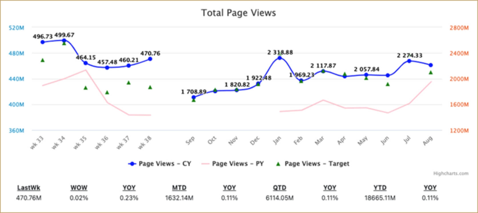
A 6_12Graph is the most common WBR ui_type. It displays the trailing 6 weeks of data along with the trailing 12 months of data on the same x-axis. It also has a summary table below the chart that lists the last week, month-to-date, quarter-to-date, and year-to-date data along with the relevant period-over-over-period comparisons expressed as a percentage.
It looks like this:
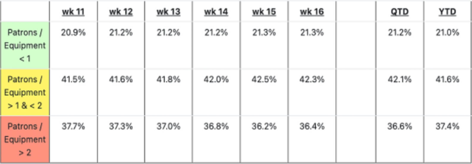
A 6WeeksTable displays the trailing 6 weeks of data along with the quarter-to-date and year-to-date data for metrics. You will need to define each row in the table. A row can contain metrics or text for headers and blank lines.
It looks like this:
A 12MonthsTable displays the trailing 12 months of data. The 6_WeeksTable and 12_MonthsTable work best when displayed together side-by-side.
It looks like this:

The configuration for a 6_12Graph looks like this:
					- block:
    ui_type: 6_12Graph
    title: “Text to be displayed at top of Block”
    y_scaling: “##(.0-3)\[BB\|MM\|KK\|%\]”
    x_axis_monthly_display: trailing_twelve_months / fiscal_year
    metrics:
      MetricName:
        line_style: primary/secondary/target
        graph_prior_year_flag: true/false
        legend_name: “Name displayed as legend at bottom”
      MetricName2 (optional):
        line_style: primary/secondary/target
        graph_prior_year_flag: true/false
        legend_name: “Name displayed as legend at bottom”
      MetricName3 (optional):
        line_style: primary/secondary/target
        graph_prior_year_flag: true/false
        legend_name: “Name displayed as legend at bottom”
A block must have at least one Metric, and may have multiple Metrics displayed. We recommend no more than three — one with a primary line_style, one with a secondary line_style, and one target.
The configuration for a 6_WeeksTable looks like this:
					- block:
    ui_type: 6_WeeksTable
    title: "Title of Block"
    rows:
      - row:
          header: "Title of Section Header"
          style: "\<valid CSS\>"
      - row:
          header: "Title of Row Header"
          metric: MetricName
          style: "\<valid CSS\>"
          y_scaling: “##(.0-3)\[BB\|MM\|KK\|%\|bps\]”
      - row:
          header: "Title of Row Header"
          metric: MetricName2
          style: "\<valid CSS\>"
          y_scaling: “##(.0-3)\[BB\|MM\|KK\|%\|bps\]”
      - row:
          header: "Title of Row Header"
          metric: MetricName3
          style: “\<valid CSS\>”
          y_scaling: “##(.0-3)\[BB\|MM\|KK\|%\|bps\]”
Note that you can create a section header or break by writing:
					- row:
    header: "Title of Section Header"
    style: "\<valid CSS\>"
Leaving the header property blank will create an empty row to serve as a section break instead.
The configuration for a 12_MonthsTable looks like this:
- block:
ui_type: 12_MonthsTable
itle: "Title of Block"
x_axis_monthly_display: trailing_twelve_months / fiscal_year
rows:
- row:
header: "Title of Section Header"
style: "\<valid CSS\>"
- row:
header: "Title of Row Header"
metric: MetricName
style: "\<valid CSS properties\>"
y_scaling: “##(.0-3)\[BB\|MM\|KK\|%\|bps\]”
- row:
header: "Title of Row Header"
metric: MetricName2
style: "\<valid CSS\>"
y_scaling: “##(.0-3)\[BB\|MM\|KK\|%\|bps\]”
- row:
header: "Title of Row Header"
metric: MetricName3
style: "\<valid CSS\>"
y_scaling: “##(.0-3)\[BB\|MM\|KK\|%\|bps\]”
You may render a section break that splits the Deck up by writing the following YAML:
					- block:
    ui_type: section
    itle: ""
You may leave the title property blank if you’d like a plain section break. Alternatively, you may add a title to render a section header.
The embedded_content ui_type can be useful in cases where you want your WBR Deck to display data from a different data source from your CSV file or you want to use a different visual display (ui_type) that is not native to the WBR App.
					- block:
    ui_type: embedded_content
    source: "enter-your-url-here"
    height:: 700px
    width: 2000px
The content generated by the URL will be displayed in an iframe with the specified pixel height and width. You can embed content such as static images or dynamic data from a system like
Looker, Google Sheets, Excel, or Tableau.
The general format for y_scaling is “##(.0-3)[BB|MM|KK|%|bps]”
Let’s go through each option.
The WBR App allows you to upload multiple pairs of YAML configuration files and daily metrics CSV files. To do so:
Upload the first pair of YAML and CSV files.
The WBR App will generate a first set of blocks.
Upload the second set of YAML configuration file and CSV daily metrics data file.
The WBR App will append the second set of blocks to the bottom of the first set.
Rinse and repeat.
When done, print to PDF.
In this manner, you can have different departments in your company submit different daily metrics data files at the end of each week, which you may then combine into one WBR Deck.
If you’d like to have block numbers run continuously throughout the entire deck, be sure to edit the block_starting_number on subsequent YAML files. So for instance, if the first set of YAML file and CSV data file renders 8 blocks, set block_starting_number to 9 in the second YAML file you upload, in order to have the next set of blocks numbered 9 onwards.
If you append ‘YOY’, ‘MOM’, or ‘WOW’ to the end of any metric name, you’ll get the growth rate for that particular metric.
So, for instance, let’s say that you have the following metric named PageViews:
					metrics:
  PageViews:
    column: "PageViews"
    aggf: sum
Behind the scenes, the WBR App generates PageViewsYOY, PageViewsMOM, and PageViewsWOW as derivative metrics. Therefore, you may use these metrics without defining them to render a block with PageViews’s growth rate:
					deck:
  - block:
      ui_type: 6_12Graph
      title: Page View YOY Growth Rate
      y_scaling: "##.1%"
      metrics:
        PageViewsYOY:
          line_style: primary
          graph_prior_year_flag: false
          legend_name: PV YOY
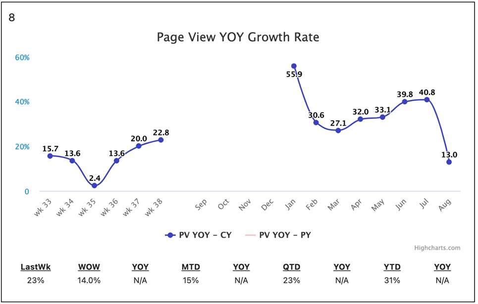
The above YAML renders the following block:
Using this approach, you may render the growth rates of any of your metrics.
When you arrive at the WBR admin home page, click on the triple bar “hamburger” menu button to view the actions you can take.
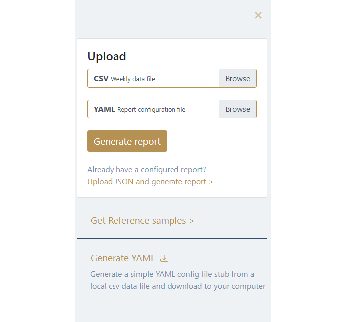

To become familiar with the WBR APP, you can download two sets of CSV and YAML files. The CSV files have some sample daily data. The YAML files contain all of the configuration information in order to build two sample WBR Decks. The YAML files have comments throughout each section to demonstrate various features of the WBR App. A WBR Deck for a typical business will be significantly larger. But these sample files should contain enough information to help you figure out how to build your own WBR Deck.
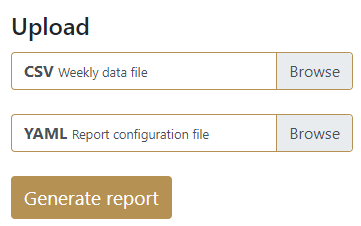
This menu option will be the one you use most often. You select your CSV and YAML files from your local drive and click on the Generate Report button. The WBR App reads these files and renders a WBR Deck. If the WBR App encounters and error, it will display a message to help you debug the data or configuration.
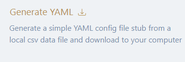
Writing a YAML file from scratch when you have dozens of metrics can be daunting. That’s why we created a feature that helps you get started on building a new YAML configuration file. To access it, click the menu button on the top left corner of the WBR App and select “Generate YAML”. .
You’ll see the following popup:
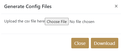
Upload your CSV file, and the WBR App will generate a sample YAML file for you to modify.
The WBR App assumes that each metric column in your CSV file maps directly to a single WBR metric. It also assumes that each metric will be rendered with a 6_12Graph. You can then take this file and modify it with any changes you need, which is much quicker than hand-crafting a YAML file from scratch.
If you have previously saved your WBR report to a JSON file, you can upload it and regenerate the report for viewing or publishing.

Once you have successfully generated a WBR Deck (by uploading a CSV and YAML file pair), ‘Publish’ and ‘Download JSON’ buttons will appear on the top right hand portion of your screen.

If you want to have a static URL that other people can use to view the WBR Deck you created, then this feature is for you. Click on the Publish button and the following popup window will appear.
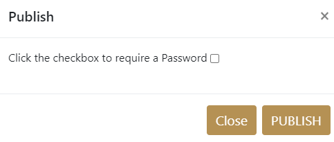
If you’d like to require a password before anyone can see the WBR Deck, check the “Click the checkbox to require a password” box. This popup window will appear.
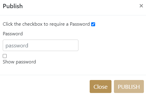
Enter whatever password you’d like and click PUBLISH.
If you do not want to require a password, leave the box unchecked, and click PUBLISH.
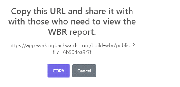
In either case, once you click PUBLISH, a URL will automatically be generated with a similar message like this one.
If you want to create a WBR Deck in another visualization tool such as Tableau or Looker, then the JSON feature is for you.
Clicking the JSON button will automatically download a JSON representation of your WBR Deck. You can then use this JSON file as source data for import into your data visualization tool of choice.
You now know how to use the WBR App to create your own WBR Deck.
For more information about the WBR, read Chapter 6 of Working Backwards.